Charting Tools - utilities to create, move and format specific charts
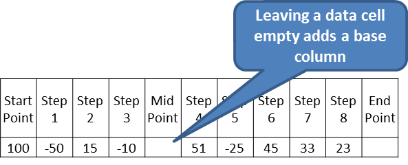
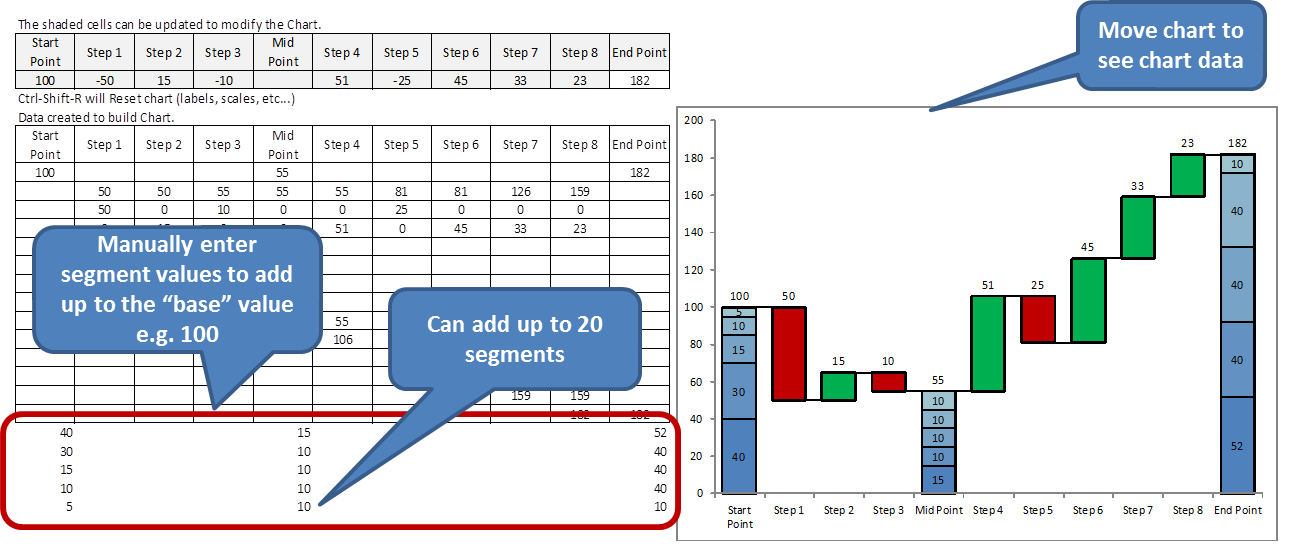
 Add Waterfall Chart: From the selection of a horizontal range (titles and values), adds a sheet with a Waterfall or Step Down Graph. Selected range must be 2 rows and at least 2 columns. The final column's title cannot be a number. The final column value will be recalculated. Buttons on the sheet allow the user to
 Basic Chart Formatter: Based on the first selected chart, other charts' settings can be changed. The Font settings for the following elements can be changed: Chart Title, X Axis, Y Axis. Font settings changed: Bold, Italic, Size and Name. Also, the Y Axis Scale: Min, Max, Crossover, Major and Minor Units can be copied and applied. The user can choose which elements to copy and choose between selected charts or all charts on the worksheet.


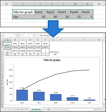
 Create Basic Pareto Chart: Based on user selected range, creates a simple Pareto Chart using frequency and cumulative frequency. Cell A1 is linked with the chart's title.
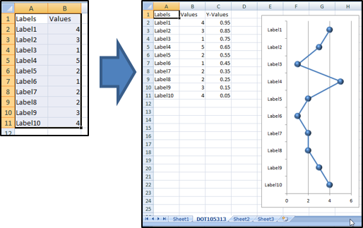
 Create Dot Chart: Based on user selected range, creates a vertical Dot Chart. The user must select 2 columns and at least 2 rows. The first row is considered a header row.
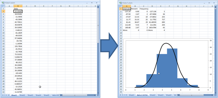
 Create Basic Histogram: Based on the selected cell down, creates a basic Histogram. The chart's intervals are fixed to 8 and the interval size is based on the data's standard deviation. The accompanying Bell shaped curved is based on 2000 "random" numbers with the same standard deviation and mean value as the data from the histogram.
 Create Normalized Radar Chart: Based on the range selected, creates a Radar chart with data normalized to a scale of 10.
The following (linear) equations can be applied to any number x in the A-B range:
y = C + (x-A)*(D-C)/(B-A) or y =D-(C + (x-A)*(D-C)/(B-A) )
where
A = the upper range limit
B = the upper range limit
C = the lower scale limit
D = the upper scale limit
The "Flip Bit" is used to adjust the Actual Normalized Number when the smaller the Actual Number is, more favourable it is - as in the case of Safety Incidents. It adjusts the smallest number to be the number closet to 10 i.e. the most favourable. Use 1 as the Flip Bit value when required; otherwise, leave it blank.
The data must be arranged as below (5 columns and at least 3 rows including a title row). The titles can be changed to whatever. Mandatory fields - KPI Limits & Actual Numbers. These can be rates, dollar amounts, integers, etc...

A Sheet is added and a chart with the normalized results is created as shown below. Data can be modified on this sheet.

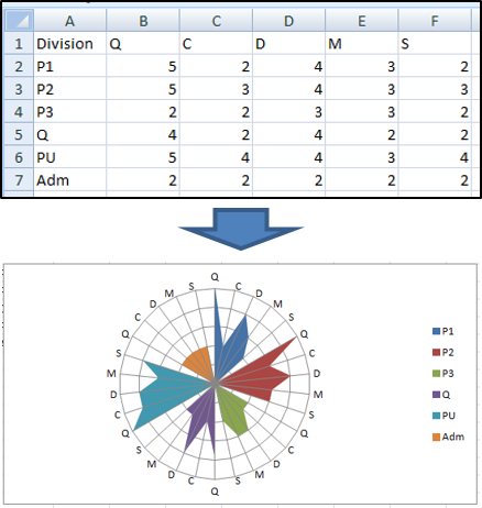
P Create Petal Chart: Based on user selected range, creates a modified radar chart to compare groups with specific categories. The Petal Chart can provide a clear visual comparison between different groups.
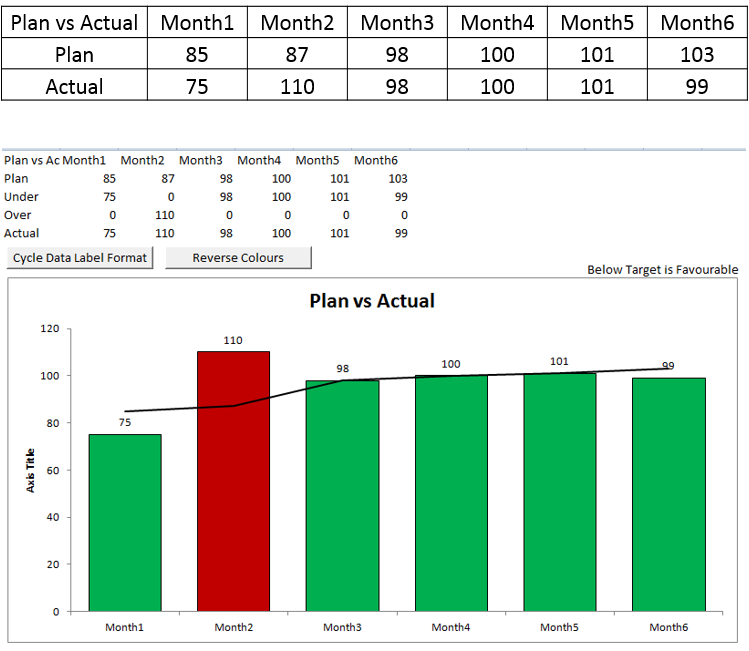
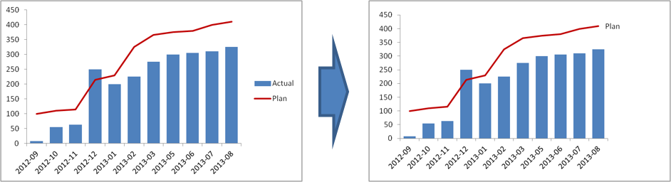
 Create Plan vs Actual Chart: Based on user selected 3 row range, creates a simple Plan vs Actual Chart. The columns' colours are set are automatically: Green for favourable to target and Red for unfavourable. Cell A1 is linked with the chart's title.
Buttons on the sheet allow the user to
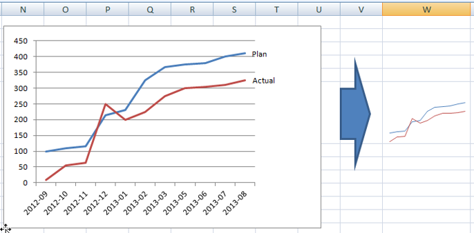
 Create Simple Chart: Select the chart to copy, size and "simplify". A dialog box prompts the user to select a range. The chart is copied and sized to fit the range. Most Chart elements are removed to leave just the data series. The simplified chart remains linked to the data source.
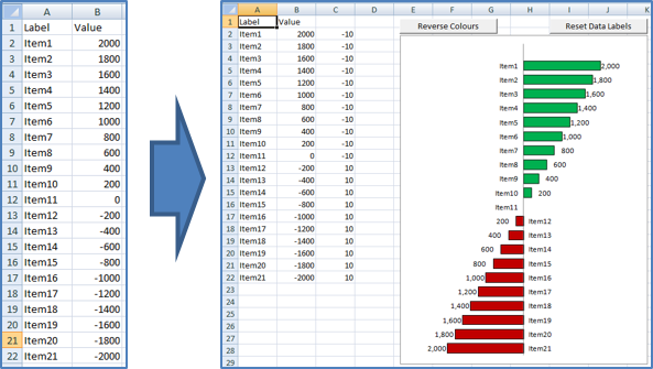
 Create T Chart: Based on user selected range, creates a modified stacked bar chart to compare positive and negative changes. Useful for creating comparisons between categories that improved or worsened e.g. IQS questions. Colours can be switched based on user requirements. The third column is used to locate the x axis labels. Works best with integers.
 Label Line Last Data Point: Select the chart to modify. A label will be placed to the right of the last data point of any line series and the Legend (if any) will be removed.
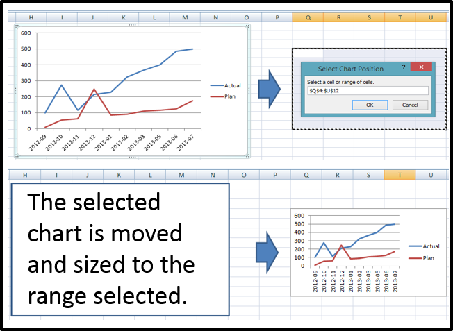
 Move and Size Chart: Select the chart to move and size. A dialog box prompts the user to select a range. The chart is moved and sized to fit the range.